
COLOR CHARTS: Why? How?
Yellow Ochre PanPastel Color Chart (detail)
WHY?
I’ve been painting with PanPastels exclusively for the last 4 years, using a limited orange-blue palette based on oil painting advice from an e-book by Joyce Washor Saltzman (see my post “Mastering the Mix”, September 19, 2016). Her approach really helped me to get control of the medium because after being a traditional pastel painter all my life, the idea of mixing color was absolutely daunting. Traditional pastel colors are not mixed. You can layer, scrumble, blend and produce all sorts of other strokes with the sticks of color to get the desired effect, but that is not the same as mixing a new color. You just have to have the sticks of color you want.
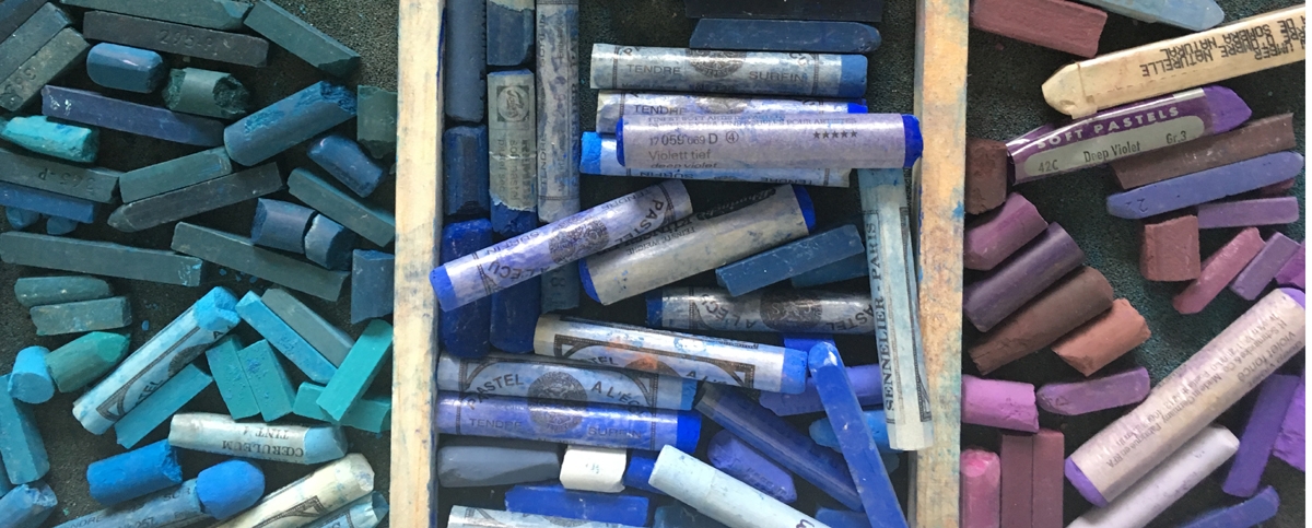
Some of my beautiful traditional pastels
PanPastels are not like traditional pastels in two important ways. First, you can mix them to create colors and second, they are semi-transparent unlike traditional pastels which are opaque. Trying to paint with Pans as if they are traditional pastels is likely to produce effects that are flat and muddy.
I’ve been happy with my limited palette and over time I’ve come to understand how my particular colors mix together either on the board or on the pans. But, getting the exact color I want has really been guesswork. And sometimes, I just can’t translate a color I see into the color I paint, whether that seeing is in real life or in my imagination. Sometimes I produce an amazing color. How I got it can be a mystery. If I want to reproduce it in another painting, it’s just a hit and miss process. It doesn't have to be that way! Having accurate color charts at my disposal can change that "hit and miss" process into one of deliberate choice.

My limited complementary orange-blue palette based on Saltzman's ideas.
An oil painter friend showed me color charts that she created based on the book Alla Prima by Richard Schmid. The charts themselves are just beautiful. I read his new book, Alla Prima II, and decided to do color charts for PanPastels. Schmid does a very nice, detailed description of doing charts in oils. I also watched Thomas Baker’s UTUBE videos (there are 3) about making oil color charts. They were really useful. I like his approach. I suppose you could just buy color charts, but the fact is, to get the learning, you just have to make you own charts.
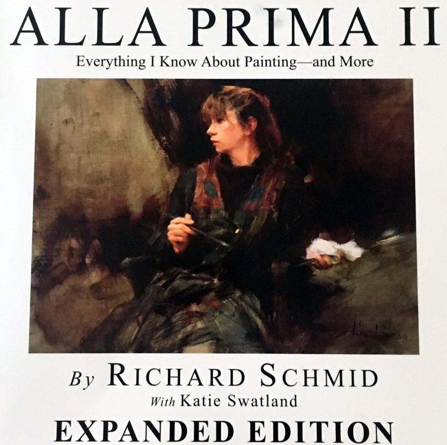
For oil painters and a really good book!
The process has been truly enjoyable and instructive! I learned so much about PanPastel as a medium and also about how color works that I didn’t know before this project in spite of the fact that I have been painting for decades! I started with 56 Pans (14 colors (hues) and the dark, shade, true color, and tint of each hue) and ended up with 720 colors! Talk about exciting and cost effective! Here is what I learned…
HOW?
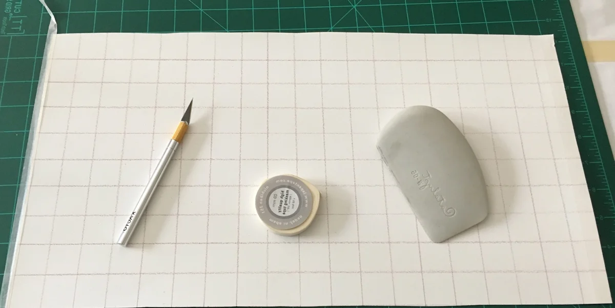
Paper, cutting mat, Xacto knife, masking tape, plastic scraper
The Materials
1. Paper or board. I used Colourfix Armadillo Sanded Pastel Paper in white. If you always paint on toned paper, you might want to use that. But, I decided to get pure clean color and toned board or paper produces less pure color. Any heavy tooth, sanded paper would work just fine. I just happened to have the Colourfix paper.
2. All four values of each of the following colors: Permanent Red, Orange, Diarylide Yellow (D. Yellow), Hansa Yellow, Turquoise. Phthalo Green, Phthalo Blue, Ultramarine Blue, Violet, Magenta, Yellow Ochre, Raw Umber, Burnt Sienna, Red Iron Oxide. You don’t really need the last 4 because those colors are all actually produced by mixing various combinations of the other colors. But, I used them because I do portraits and figures and these are important for that work. I wanted to see how different the bought-colors were from the made-colors. I did them as separate charts. Those last four colors are not in my Master Palette shown here.

Permanent Red, Orange, Diarylide Yellow, Hansa Yellow, Turquoise, Phthalo Green, Phthalo Blue, Ultramarine Blue, Violet, Magenta
3. Applicators. I used a flat headed cotton swab (see image above). Probably any cotton swab or cheap makeup applicator could work. In the process completely by accident, I found that Mr. Clean Magic Erasers worked very well for creating halftones. (I'm not sure these are available everywhere and cheaper knock offs of this product don’t work as well or at all). You could use Sofft Tools by PanPastel, but that would be expensive and troublesome since the applicator must be absolutely clean for each square of color you apply. I found I could use one cotton swab applicator for each 2 Pans, but really, they were cheap and using a new one for each square of color was best.

Useful for making halftones, but not absolutely necessary
4. Ruler. I like a see-through type. This will enable you to see your lines while drawing them.
5. Pencil. I used the hardest graphite pencil I had, 7H, because I didn’t want graphite everywhere. On the sanded paper, it was still a bit messy. I tried colored pencil, but it wore down much too fast. Unlike oil charts where you can erase the pencil lines once the oil dries, you can't do that very easily with pastel without smudging them. At least, I couldn't.

6. Masking tape. I LOVE Nichiban high quality masking tape. The product I used is # 251, 3/8”. But if you make larger charts you might want wider tape. This product is terrific! You can see your pencil lines through the tape and it’s strong, but easy to remove. www.japantape.com
7. Nice to have: Xacto knife for cutting the paper and the tape. A ruled plastic cutting board. You can certainly make these charts without either, but they make the process go much faster and easier. I also used a flat plastic scraper to press down the tape. Don't press down the edges that extend past the paper. Leave them floppy to make the tape easier to remove later.
The Process
Preparing charts
1. Decide on your Master Color Palette. These colors will become the basis for all your charts. My master colors are based loosely on Richard Schmid’s and also on the colors of Blue Earth Pastels. But for a full spectrum palette, any combination that includes a red, a blue and a yellow (primary colors) PLUS an orange, a violet, and a green (secondary colors) will work. I decided on Phthalo Green because it is the closest in color to Viridian which Schmid uses. I debated using both D. Yellow and Hansa Yellow, but since D. Yellow is basically hot and H. Yellow is mostly cool, I decided to do both. I’m not sure you really need to do that, but again these produced a palette more like Schmid’s and also like Blue Earth’s. I love the Blue Earth colors!

My Master Color Chart Palette
2. Decide on the size chart you want to make. Mine are 10” by 6” (except my earth color charts are 11” x 6” since I needed an additional column for the earth color). Each Master Color has its own chart. I had 10 Master Colors, so 10 charts. I wanted 5 values of each hue because I use a 5-value gray under painting. But Pans come in 4 values and unless you also do a 5-value under painting, 4 values of each hue works just fine.
3. Cut your paper to the size you want. (Before you cut, see # 4.)
4. Now rule the paper to have one column for each hue (color) and 4 (or in my case 5) rows, 1 for each value. Add an extra row at the top for the names of the colors. You will have either 5 or 6 rows. (I found using a fine point Sharpie to label the colors was a good strategy. At first, I used a pen and this didn't show up well.)
5. Place your masking tape so that the pencil line is directly in the center of the tape (this is why you want the see-through masking tape). Cut the tape with your Xacto knife so that there is about an inch on each end and leave these ends loose to help you to remove the tape later.
6. Now you have a nice piece of paper are ready to receive color.

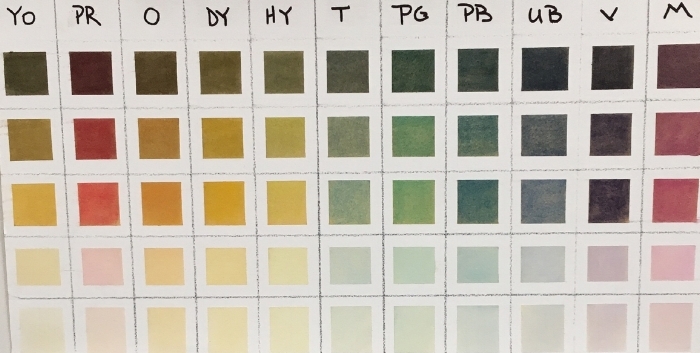
This sheet actually has 3 charts on it. Each chart has 6 rows and 10 columns. (PS Just reminder, “Columns” go down the page, “Rows” go across the page)
7. Make your Master Color Chart first. This chart will have all the values of each color that you chose. In my case, I arranged the chart going from warm to cool colors and from darkest to lightest. But, you can arrange them any way you like. So, I started with Permanent Red and ended with Magenta. The full spectrum. You don’t have to do a full spectrum chart. You can do a limited palette chart, but just to get to know what’s possible, I recommend a full spectrum chart to begin with. Once you know what your Master Chart looks like, you make a chart for each master color mixed with every other master color. The principle is that every color (and every value) on your Master Chart will be mixed with every other color (and value). Doing this will enable you see and reproduce each color that is possible with the palette you’ve chosen.

My Master Color Chart (pardon the writing errors!)
Applying the PanPastel
1. Take the darkest value of your first color and using a soft scrubbing motion completely cover the 1st top left-hand square. Use enough pastel so that it appears opaque. No white should show through. Be a bit heavy-handed. Then, put about half that amount on each of the other squares on the same row. So, Permanent Red was my first color. The darkest value of Permanent Red is on the far left. The rest of the squares on that row are also the darkest value of Permanent Red but applied much more lightly. I was going for a halftone. Schmid says don't mix exactly 1/2 and 1/2, but Baker says do. That was hard to do in pastel (much harder than oil). I went for halftones. Repeat this process for each value. If you are doing 5 values like I did, on the last row cover each square in White PanPastel and then very lightly put the lightest value of the color over the white. This should give you a very light version of the color. Because Pans are semi-transparent, it really matters which color is on top. You will see what I mean when you make your own charts.
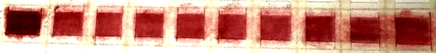
The full strength Permanent Red is in the first square on the left. The other squares are a half-tone of that color. You can see that the squares on the right are still too saturated and need to be lightened. Square #5 from the left is about right.
2. On the second top left square ( COLUMN 2, ROW 1)put the darkest value of your second color over the darkest value of your first color. In my case the next color was Orange. So, on the second square in ROW 1 in the image below, you see the darkest orange over the darkest red. Continue with all the other colors on your Master Color Chart. At the end of ROW 1 you will have all of the darkest values of each of the colors on your Master Color Chart mixed with the darkest value of your first color that is in ROW 1, Column 1. Repeat this process until you have the done this with all the values of each color on the Master Color Chart.
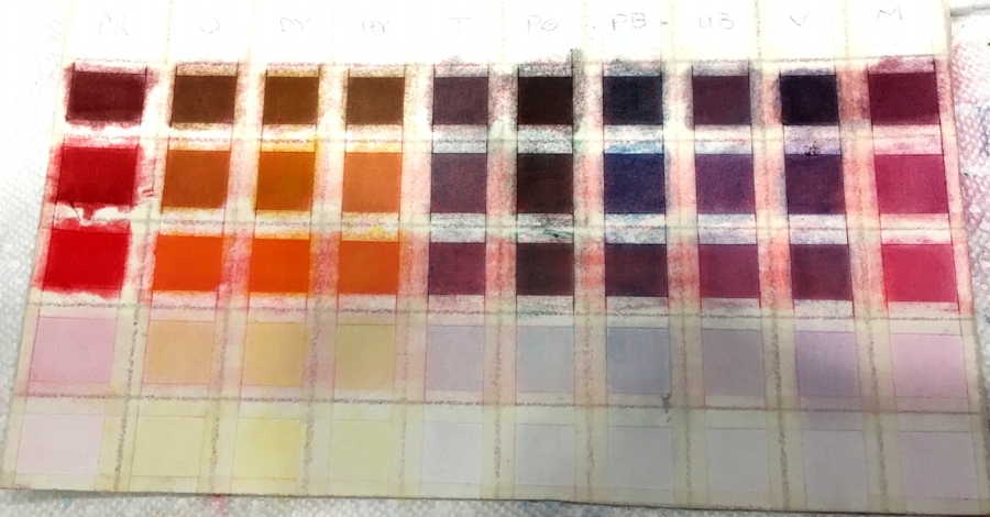
Columns are left to right: Permanent Red (PR), PR + Orange, PR+ D. Yellow, PR+ Hansa Yellow, PR+ Turquoise, PR+ Phthalo Green, PR+ PHthalo Blue, PR+Ultramarine Blue, PR+ Violet, PR+Magenta
3. As you finish a chart, carefully remove the masking tape. You will love the nice, tidy squares of colors that you didn’t even know existed within your Pans! 😊

Tape removed and viola! Nice, clean, accurate, color!
Wonderful painters understand color and who among us doesn’t want to be a wonderful painter? So, it’s essential to understand how to achieve the colors we want. If you’re a realist painter painting from life, then achieving the right color is a matter of knowing how to get the color you see onto to the paper (canvas, board). But, even if painting abstractly and entirely from the imagination, knowing how to get the color that exists in the mind’s eye is source of great satisfaction.
Even if you have a good sense of color and a good memory for color, making color charts is an excellent way to develop a deep understanding of color. Reading color theory books, looking at painting videos, and attending workshops are important, but they won’t give you the visceral and cognitive understanding for color that making color charts will give you. Embodying the process in a systematic way creates a much deeper understanding as the Old Masters knew, that’s why making charts was an essential part of painting apprenticeships back in the day. Making charts is also an excellent way to get to know your medium, how it handles, which colors are smooth, which are gritty, which are more saturated, which less intense.
Lastly, I am happy to respond to any questions you may have. Just go to my contact page and drop me a note. I check e-mail once a day.
HAVE FUN MAKING YOUR OWN PANPASTEL COLOR CHARTS!