The importance of good art direction

So the big secret project that I’ve been working on has had me thinking about the importance of good art direction in tabletop games recently. Good art direction can make an already fun game compelling and engage new audiences. However, even art direction that is simply mediocre can have the opposite effect by alienating potential customers before they even get a chance to explore what your game is about.

There are a lot of things that go into what makes for good art direction – is the art well-crafted? Is it relevant to the game you’re trying to sell? Is it evocative and inspiring? Does it reflect the play experience you are trying to create? All of these are important goals to strive for in good art direction. But just as important, and sadly almost universally overlooked by major game publishers, is overall inclusiveness of artwork. And I say this not as a feminist culture critic, but as a game publisher.

The reason tabletop RPGs are so art-heavy is because good art sells more games. Quality art by artists capable of doing professional-looking work is not cheap, and acquiring art assets is expensive both in terms of dollars and time spent. Companies like WotC, Paizo, and the rest are ultimately in it for the profit, even if individual employees might happen to be passionate about the medium; they wouldn’t go through the tremendous hassle of procuring such large numbers of art assets if it weren’t ultimately profitable to do so.

By that metric, inclusiveness is every bit as important as craft or any of the other common standards of what makes for good art direction. I can’t tell you the number of times my very first exposure to a game has been through some piece of bullshit sexist art – usually a cover or promo image – that has completely turned me off ever wanting to purchase or otherwise support the game[1]. Given that women account for nearly half of tabletop gamers, this is a pretty huge failure of art direction. Good art direction should only ever expand your potential audience, not eliminate potential customers right off the bat – especially when those potential customers account for nearly half of your market.

The problem is that good inclusive art direction can be a lot more challenging than it looks. Even if you have a design and development team who want to create an inclusive product, that doesn’t necessarily mean that the end result will be stereotype-free. The sheer number of illustrations that most finished games contain means that most development teams will be working with multiple artists. Each artist will bring their own entrenched attitudes and biases, and none of the artists will be looking at the overall picture, so without a concerted effort to keep an eye on the big picture even a well-intentioned development team can wind up simply replicating the industry standard in terms of unfortunately stereotyped art.

So with all of that in mind, let’s take a look at two of the most common pitfalls that get in the way of inclusive game art.

Obstacle the first: Defaultism

First, defaultism is a bit of a tricky thing to define, so I’m going to quote the excellent Strix:

Defaultism is the idea that we fall back on the status quo when something is not defined. We go with what is most familiar and “normal.” White Americans are a little over two-thirds of the population, but the vast majority of our media is dominated by this demographic, not just in games, but movies, TVs shows, and books. Because of the primacy of white characters in media, if a character is not explicitly stated to be of a different race they are often assumed to be white. Similar problems arise with gender expectations and sexual orientation. … Most gamers unconsciously gravitate to the straight white male as our hero, our role model, and the baseline for play. — Whitney Strix Beltrán

(Really you should read Strix’s entire piece on Tor.com about defaultism, it’s quite wonderful.)

Given that the population of people working in professional game development skews overwhelmingly white and male, it shouldn’t be surprising that defaultism is a major problem in roleplaying games. Every numbers post I’ve ever done shows that across all sectors of gaming, depictions of men consistently outnumber depictions of women, and that when women are depicted they are often stereotyped in harmful ways. Defaultism at work, friends.

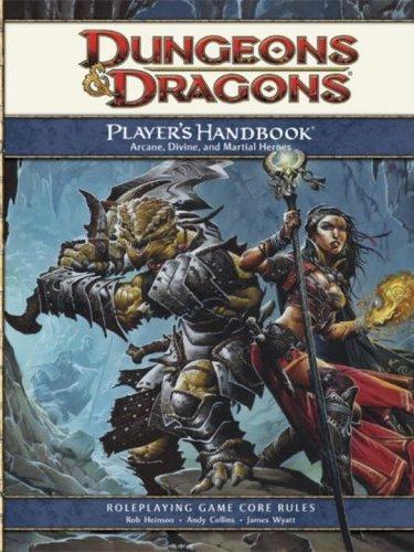
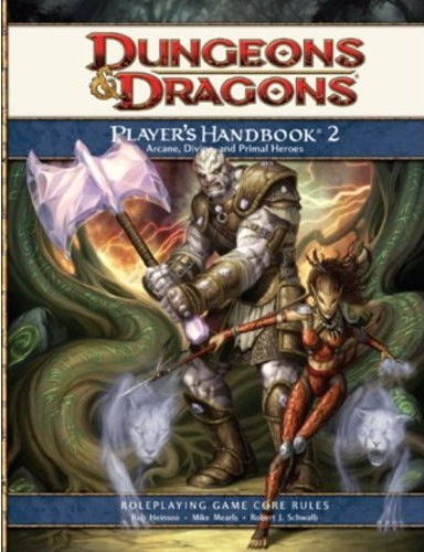
The problem with defaultism is that even when you’re aware that you have a problem and need to increase inclusiveness in your product line’s art, attempts to take action can have mixed results. Wizards of the Coast, the company behind both D&D and Magic: the Gathering, is a great example of this. With the new edition of D&D, WotC has done a fantastic job of making the new core books inclusive across both racial and gender lines. Unfortunately, the same can’t exactly be said of Magic.

While it’s true that recent expansions have gotten much better in terms of reducing the number of horribly stereotyped and objectified women, it’s also the case that the reduction in depictions of objectified women has probably directly resulted in a much lower number of female characters overall. Unfortunately, it seems that for a fair number of artists working on Magic, the priority is: 1) men 2) sexay wimmenz 3) men 4) non-objectified women with agency.

However, this shouldn’t exactly come as a surprise to the team handling art direction for Magic! Many of the artists illustrating for them are artists they have worked with for years, with known habits, tendencies, and preferences. Given the extreme willingness of some Magic artists to throw card concepts to the wind in favor of sexay laydeez, it’s actually depressingly predictable that an effort by WotC to crack down on depictions of bullshit sexism would result in artists just saying “fine, I won’t draw women at all then”.

Thankfully, there is a way to get around this: always plan for the big picture! Rather than leaving variables like gender and race up to chance or the whim of your artists, make a master plan of all of the illustrations that will be needed for a given project and assign gender/race to each spec before handing out specs to artists. In all likelihood, it will feel silly the first time you plan a project this way. But the reality is that each of us carries biases and stereotypes that require conscious effort and planning to counter.

Of course, taking steps to counter defaultism will likely mean that you’ll encounter…

Obstacle the second: Rogue artists

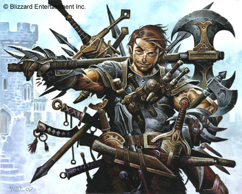
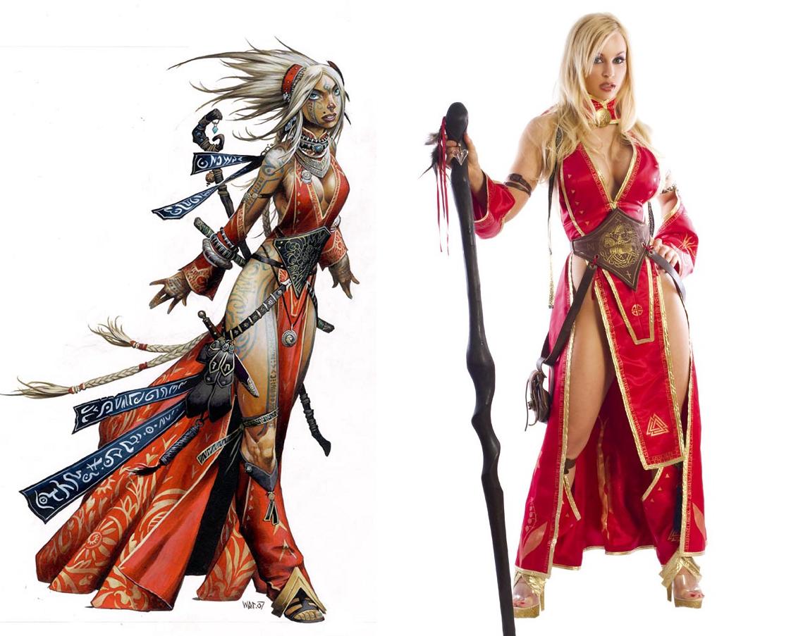
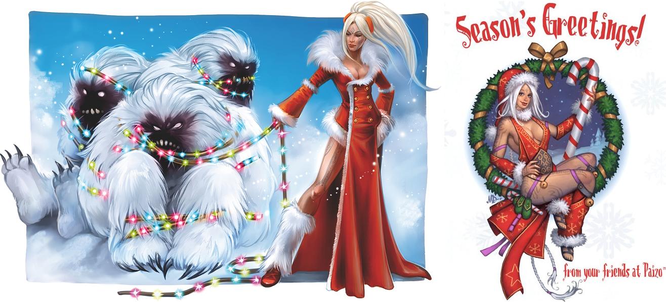
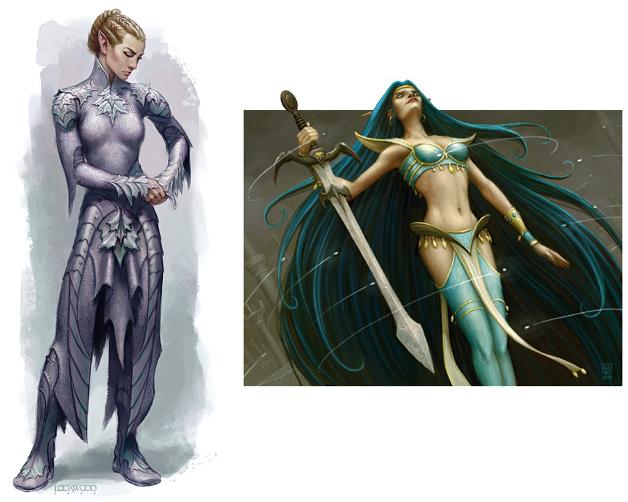
A nontrivial subset of established game industry artists are men with, shall we say, entrenched views on how women should be illustrated[2].  And quite often, when these artists are handed a spec that calls for a female character, they will find a way to make that female character sexxay even if it makes no goddamn sense. I’ve taken to calling this Wayne Reynolds Syndrome, as the eponymous Wayne Reynolds is a goddamn master at sneaking cleavage into illustrations where the art spec clearly called for a woman who is strong, competent, and not sexualized:

Imrijka_360
Illustrations by Wayne Reynolds

(God dammit, Wayne.)

Now look, I understand that the idea of telling legendary artists like Wayne Reynolds to go back to the drawing board (see what I did there) when they hand in a sketch with sphereboobs and gratuitous cleavage can be off-putting. And sure, Wayne’s women might be overly sexualized, but at least they are also powerful and have a real sense of agency – and that’s no small thing, right?

But again, that is a failure in art direction. Is it extra work having to send drawings back to be revised? Absolutely! Can artists accustomed to drawing objectified women be truculent about making appropriate revisions? You bet! Is it a hassle to have to write emails saying things like “can we have this without ridiculous cleavage” or “please get rid of the nipples” or “give her pants and also make this less crotch-ular”? For sure! But guess what, if you’re responsible for art direction, it’s also your job.

Thankfully, while rogue artists can be an irritating to deal with, they don’t present an insurmountable hurdle. As the publisher, you have all of the power in the employer/employee relationship – artists work for you and not the other way around! When an artist hands you a draft that doesn’t meet your standards, don’t accept it. You don’t need to be apologetic or defensive or embarrassed. Don’t make apologies or justifications, either. Simply be firm and say “this doesn’t meet our needs, these are the revisions that need to be made”. That’s why they call it art direction – you are there to provide directions for your artists.

Caveat: There are more obstacles to inclusive art direction than just these

…which should be obvious, right? One of the biggest problems with making game products that have truly inclusive art is the demographics of the industry and the terrible reality of privilege. Even with the best intentions, sometimes some nasty shit is going to slip right on through thanks to the effects of privilege. When harmful stereotypes don’t affect you, it can be really hard to see them even if you know you have to watch for them!

However, by taking steps to plan against defaultism and taking a firm hand with rogue artists, you will already have a huge leg up on the competition. Because the sad reality is that the bar is already so low that even a moderate attempt at inclusive art direction will still be a huge improvement over most of what’s already out there.

[1] Case in point: there are several people on my G+ talking up Smite right now. Apparently it’s solidly reliable fun! But with character design like this, there’s no fucking way I’m ever going to give it a chance.

[2] Although, honestly, there are a lot of amazing not-dude artists out there. And while there are women who do pinup style artwork as their primary focus, generally I’ve found that female artists tend to be a lot more receptive to not automatically sexualizing all female characters.

>Industy artist fail: Wayne Reynolds (at least he’s not as bad as HTK)

>

[Preamble and Disclaimer: All of these can be seen at much higher resolution if you click the images. I recommend doing this. And as always, none of this is mine. All of this is copyright Wayne Reynolds and/or whichever company hired him. I don’t own a thing!]

I’ve been meaning to write this post for quite a while now – it just kept getting put off every time I spotted more egregious stuff I wanted to post about. But Wayne Reynolds has long been a pet peeve of mine when it comes to fantasy tabletop art, and I thought it was important to highlight his artwork because he is a huge name within the fantasy art industry. I will certainly be the first to admit that skill-wise, his artistic chops far exceed my own; however, Mr. Reynolds is a perfect example of an artist using his powers for evil.

Now when I say “using his powers for evil”, let’s be clear. Wayne Reynolds is no HTK. Even if he has a propensity for stupidly cheesecakey women, his cheesecake women are definitely active and strong characters. Also, for the most part the only anatomy distortion that they suffer from is an over-inflation of the breasts, which is also a far cry from HTK’s barely-human-looking crotch-thrusting figures.

In a way, that is actually part of my frustration with Wayne. I know that he’s capable of producing totally epic, non-sexualized female characters that kick huge amounts of ass when an art director puts their foot down and insists on NO CLEAVAGE WAYNE I MEAN IT. I mean check these women out:

Totally epic, right? Any of these women would be completely badass characters for long-term play. Each of them is strong and has a real sense of character. I mean I’ve talked about how much I love Seelah (paladin, far right) before here. But sadly, I had to look pretty hard to find these examples. For the most part, Wayne prefers his women looking like this:

/sigh

Don’t get me wrong. Tiger lady is pretty badass, for sure. But, you know, does she have to have her tiger bits hanging out like that? Now, it wouldn’t be so bad if Wayne had a habit of doing equally sexualized illustrations of male characters. I’ve long said that I wouldn’t mind a line that just sexified everyone equally regardless of gender; it might not be to my personal tastes, but I could at least get behind it’s existence. And Wayne does occasionally do illustrations of sexy male characters like Seltyiel:

But sadly, Seltyiel is pretty well in the minority for male characters in Wayne’s art. Mostly Wayne’s men tend to look like this:
…covered head to toe in armor and in poses that don’t emphasize their sexy bits. (Okay, maybe not with quite that many weapons. I couldn’t resist the opportunity for a bit of visual hyperbole…)

Now this isn’t exactly new, and it certainly puts Wayne in good company with many other fantasy game artists. The male = fully armored & not sexualized / female = chainmail bikini and heaving bosoms paradigm has been pretty dominant in fantasy game art ever since the creation of D&D. And at least Wayne manages to draw women who look competent while thrusting their scantily clad bosoms out for the rest of the world to see, which is certainly a far cry from women in cages.

Still, it’s pretty discouraging when Paizo hires Wayne to design their iconic sorceress and he comes up with this:

Wow! How distinctive from every other female mage ever! A gorgeous woman with big fake boobs and not enough clothing. I mean, come on – she’s practically walking fanservice. Unless she’s using body glue to hold that top in place, there’s no way that top is going to confine those ta-tas once she starts dodging arrows. But then again, I suppose she could use sorcery to the same effect? Still, it seems like a waste of a spell slot…

And Seoni is far from the only example of Wayne’s stereotypically slutty cleavagey mages:

Okay, can the female = mage = slutty cleavagey stereotype please die now and forever please? The female = mage stereotype is bad enough! God knows I get so sick of seeing female characters get railroaded into being magic-users and not being allowed to swing an honest-to-god weapon at people. But it’s DOUBLY frustrating to see the mage = slutty cleavagey stereotype in action, because it just reinforces the “tits or GTFO” that women in gaming get all the time.

The trap that fantasy women fall into is that if all women are mages and all mages show their tits, then clearly all women show their tits! And Wayne certainly isn’t doing much to dispel that notion either. But then I think that stuff like this:

…makes Wayne’s opinions on the importance of breasts in fantasy art pretty clear. Sure, none of these women are in cages, but it doesn’t exactly feel very progressive to say “sure women can be adventurers” when the clear parenthetical is “as long as they show us (male gamers) their tits”.And most of these aren’t even NICE tits, which is kind of bizarre given the fact that these figures are otherwise pretty undistorted. (They’re all Barbie, sure, but not too distorted.) All of these women have bizarrely inflated sphere boobs that in some cases aren’t even that appealing. I mean, the gnome and the hook fighter especially have boobs that just kind of freak me out – it looks like someone taped melons to their chests. How is that in any way appealing?

The only one of these women that I in any way appreciate is the fire mage; her chest is actually quite small. Still, body paint =/ clothing and gee it would be great if she HAD SOME DAMN CLOTHES.

The ones that make me the most frustrated though are the ones where the art direction was pretty obviously for a strong, FULLY-COVERED female character and Wayne gave them cleavage anyway:

I mean, Christ, Wayne. Looking at these, I hate to think of what initial drafts of Seelah might have looked like. Did you honestly think that people wouldn’t notice the random cleavage? It’s especially frustrating on these characters because they come SO CLOSE to being every bit as awesome as the first set and then fall flat on her face. Is there ANY reason for us to see Imrijka’s (far left) hugely inflated sphere boobs? No. Does being able to see Merisiel’s (middle) tits somehow make her a better, more compelling avatar? No. Does being able to see the pirate’s tits AND panties make us more able to believe in her strength? Um… no.The worst part is that I can so clearly see what these characters could have been had they not been gratuitously sexualized. Please – can’t we allow strong female characters to be strong AND female and not have to show their tits to the world? Why do we have to do this? Why do we have to continue to tell women that they can only expect to be strong and competent so long as they agree to dress for the titillation of their male counterparts?

Fuck that. I want women who are badass and not sexualized:

So how about it, Wayne? You’re clearly able. Now are you willing?

>Paizo: Thanks for not being full of race fail, but…

>do you think you could maybe be a little less full of gender fail?

[Hi, kids! Just a little pre-amble. I wrote this when I hadn’t been blogging for very long, and parts of it are super slut-shamey. And that’s awful! Unfortunately, this being the internet, I can’t take it back. It’s out there forever, so there’s really no point in trying to pretend I never said it.

I have since regretted the slut shaming I did in this and a few other early posts and have made a point not to do it in my current work. So please consider this post in context. Thanks.]

[Preamble and Disclaimer: All of these can be seen at much higher resolution if you click the images. I recommend doing this. And as always, none of this is mine. All Pathfinder material is copyright Paizo. I don’t own a thing.]

So the first time I heard anything about Pathfinder was actually in a forum thread about positive female characters. Someone linked to pictures of Seela – Pathfinder’s iconic paladin, and Seoni – Pathfinder’s iconic sorceress:

These pictures blew my mind, especially the picture of the paladin. Two completely kick-ass, non-white female characters! And okay, sure, the sorceress is a total slut-bag, whatever. But oh my god I loved the paladin so, so very much. This is what I wanted and never saw in my fantasy art! It made me so very happy to know that there was an RPG publisher out there whose head wasn’t completely up its ass when it came to gender/race issues.Now that’s not to say that Paizo gets a total pass on the race front. Paizo is still guilty of race fail on occasion, like with the official photo promoting their 2010 GenCon costume contest. For the contest, they had a photo of someone costumed as Seoni, the aforementioned sorceress:

Sing it with me kids! One of these things is not like the other, one of these things just doesn’t belong… I mean, come on guys. I’m sure it couldn’t have been too hard to find a racially appropriate model to pose for this photo. It’s not like white women have a monopoly on big fake breasts! And oh yeah, thanks for promoting your products at GenCon by encouraging women to dress up like cleavagey skanks. I mean, please. Wayne Reynolds really doesn’t need more encouragement to draw shit like this.Then again, as this photo taken by Sean K Reynolds shows, it’s not like this is the first time that Paizo has used boobs at GenCon to sell their products:

And the thing is, if it was Wizards or Blizzard or the like, I’d roll my eyes and call it par for the course. But it’s doubly disappointing coming from you, Paizo considering your obvious attempts to not completely whitewash your settings. Why take so much time to balance your depictions of non-white characters if you’re just going to make all of your female characters standard fantasy cheesecake?When you go through the portraits that are posted on the official Paizo blog, you do see a very diverse mix of ethnicities. But for the most part the portraits of women are at least mildly problematic. To illustrate my point, I’ve compiled a bunch of their portraits – which I’ve rated on a scale of WTF to awesome:WTF:

/facepalm

Okay. So first of all, mummies are not that hot. There’s this thing that happens where all of the moisture is removed from their bodies, which is what makes them mummies in the first place. There is absolutely no way that a mummy would have breasts that perky, or such a curvaceous backside. Also, real mummies are wrapped in so many layers of cloth that there’s no way they’re just going to start walking around.

Then we have Naked Dinosaur Chick. And again, seriously, what are you thinking? We’ll leave aside the question of why the dinosaur isn’t trying to eat her and consider the problem of her nudity. There’s a reason why women’s bike shorts have a lot of crotchal padding. (Yes I’m inventing words. Shut up.) It’s because bicycle seats can be painful for extended periods of time. I’m going to go out on a limb and say that having your crotch pretty much in direct contact with a dinosaur’s spine has got to be way worse.

And flying chick… So many anatomical problems. Like her shoulder connecting directly to her ribs. Or her lack of a neck. Or an ass. If you’re going to publish ridiculous cheesecake, at least get the basic anatomy right.

Bad

Hey look! Big fake boobs! At least the drow looks somewhat badass, which is more than can be said for the other two. I do have to give Wayne Reynolds props for that. His cheesecake women are at least never passive princesses waiting to be rescued. But it would be great if he could do NON-cheesecake badass women too. [Note: apparently the drow is by Steve Prescott, whoops! I’ll stand by my comments about the art, and my comments about Wayne, but he didn’t actually perpetrate this particular cheesecake indignity.]

Yawn. Cleavagey noble, check. Woman with cleavagey/disintegrated clothing, check. The “Persian Princess” on the right is actually disappointing because she comes SO CLOSE to being completely awesome. I love the costume, love the sword, love the jewelry, and love the fact that she actually looks Persian. So why, oh WHY the random cleavage? It’s like running 4.75k in a 5k race, then deciding to quit and go to Tim Hortons for doughnuts.Meh

No surprise here, numbers one and two are Wayne again. Come on, Wayne! It’s like he gets art direction asking for fully covered women and says to himself, “well, no one will notice if I stick in some cleavage”. It’s especially ridiculous on the woman in plate mail. Why go to all the effort of getting plate mail made if it doesn’t protect from heart-stabs?? The woman on the right I included despite being fully covered because she’s just… so… insipid. But that’s a judgement call on my part, I guess. [Note: Number one was also miscredited and is actually by Steve Prescott. Though, again, I stand by my commentary on the art and my commentary on Wayne’s art in general.]
Awesome

THIS! Oh my god, this! More of it! More of it, I say! THESE are the women I want to see in my roleplaying products. The cleric on the left is everything that the Persian Princess should have been! The duelist in the middle, I heart her so much! And Seela the paladin remains one of the best pieces of fantasy art I have seen ever! Yes I need this many exclamation points!See, it’s stuff like this that makes me delighted, makes me think that someone out there is listening to us! We’re finally getting the strong, non-sexualized female avatars we’ve been asking for! But then you turn around and do shit like this for the holidays:


(from 2009 and 2008 respectively)

And that just makes me disappointed, because these are supposedly a “thank you” to your customers. I’m not a customer, but even if I was I wouldn’t want to be thanked this way.So I guess how I feel about Paizo is kind of like how I feel about Enterprise. There’s just so much raw potential for awesomeness, but the reality just fails to deliver.

>Mixed Messages in D&D 4th Edition

>So it has to be said that Wizards has made strides in improving how women are portrayed in 4th Edition D&D. It’s certainly a lot easier to find images of women who are both fully clothed and active. You also see a lot more pictures of women as fighters, where in the past any woman in armor was by default a cleric. Furthermore, I’ve been quite pleased by some of the images I’ve seen of strong, competent, not sexualized women.

The problem is that Wizards seems to want to have their cake and eat it too. It seems like for every fantastic image I see, there’s somewhere between one and two really awful ones. What’s worse, when you see women on the covers of 4E books they’re almost always cheesecake women and not the positive strong women I just mentioned. (Case in point: The Adventurer’s Vault 2, Dungeon Delve, The DMG 2, The PHB, The PHB 2, The PHB 3, and too many others to count.)

So I thought I’d do a little side-by-side comparison of some really great pictures of 4E women right next to some really awful ones. These are images that I found in two threads (good art, bad art) in the Astrid’s Parlor forum on the Wizards site. As such, I don’t own the rights to any of this. See the end of this post for the cover-my-ass boilerplate.

(Noteably, unlike my last post, there are larger versions you can click through to of the below for more detail.) First up we have:

So here we have a comparison of different approaches to the badass pose with weapon. The woman on the left really does look badass. Those weapons are most definitely not for show. (Incidentally, this is one of the few images by Wayne Reynolds that I found that WASN’T guilty of egregious cheesecake. Maybe he got tired of all those uncovered boobs.) The woman on the right – what is she doing? Getting drunk? That would explain her complete lack of caring about the sideboob. I know which one of these two women I’d rather take on.

So D&D is purported to be loosely based on medieval Europe. The wizard on the left is a good example of that, with her costume looking pretty similar to stuff you might see in that period. The woman on the right, however, appears to be wearing absolutely nothing to cover her backside – which I’m pretty sure isn’t in keeping with the feel of medieval Europe. Last time I checked, Europe gets pretty cold and, dude, a tail is not a replacement for pants.

I’ll also note that despite the fact that the tiefling is actually casting a spell and “controlling the elements” or whatever, I find the halfling far more imposing. I love the “don’t fuck with me” expression on her face.

Another contrast in spell casters, here. Overall, the art for the female dwarves has been pretty fantastic and positive in 4E, and the mage on the left lives up to that standard. The pose is pretty neutral, but the shadow-serpent and the expression on her face make her someone not to be dismissed lightly. And sure, the mage on the right has a more active pose – but she’s pretty obviously posed that way so as to display her, uh, attributes to their maximum advantage.

Also, the anatomy is problematic on the slutty-mage – she’s suffering from a pretty serious case of sphere-boob. She also doesn’t seem to have any hips, which is kind of bewildering. Maybe the only difference between the sexes for elves is that women are just men with boobs tacked on?

These are, unfortunately, both depictions of female fighters. Don’t ask me how the chick on the right is supposed to fight in that getup. I’m sure she spent a much longer time getting her hair to do that than getting into that “armor”. The sad thing about this is that the woman on the left is both powerful and feminine. The chainmail she’s wearing is clearly serving a function and actually covers all the stuff you’d want to protect when hacking at people with swords. And, personally, I find the woman on the left a lot sexier than the freak show on the right.

What to wear when hacking at people with swords: Part Two. Again, fantastic female dwarf. Again, I love, love, LOVE the “don’t fuck with me” expression. Whereas the woman on the right is wearing a tube-top held together with a few pieces of string. Here’s the deal, guys. I’m approximately that well endowed, and there’s no way in hell I’d trust that top to keep the girls contained. Also, what’s with the visible thong? Did medieval Europe have Victoria’s Secret? Lastly, look at the poses. The dwarf looks like she’s two seconds from smashing your face in with that giant hammer. The human just looks like she’s posing for a glamour shot.

Okay, we’re going to end with how to portray threatening women. The woman on the left is strong and competent. She’s not just swinging the spear around for show. Whereas the women on the right… Okay, okay, yes they’re succubi. They’re “supposed” to be sexy. But succubi are demons, for crying out loud! Practically immortal beings from another plane that are supposed to eat men for breakfast! These women don’t look like they’ve eaten anything more than a lettuce leaf for breakfast.

Furthermore, they’re in these awful “look at me, I’m so sexy” poses, but the anatomy is so distorted that I have a hard time seeing them that way. Their waists and shoulders are both way too small. Plus, you know, the boobs. Again, guys – BOOBS DON’T WORK THAT WAY. Christ, the succubus on the right practically has a shelf. I’m surprised she doesn’t carry stuff around on that thing.

So, yes. D&D is making strides, but they’re no Paizo. (Not that Paizo is perfect either.) And when you consider how many of their covers have cheesecake, it makes me wonder if they have any real intention of improving their depictions of women past this point.

[Oh yeah, the boiler plate. This blog is not affiliated with, endorsed, sponsored, or specifically approved by Wizards of the Coast LLC. Wizards owns everything, I own nothing. For more information about the products these are taken from, go to the Wizards website.]