


How to Add Text to a Photo on iPhone Using Markup & Visme
![How to Use Pastel Colors in Your Designs [+15 Delicious Pastel Color Schemes]](https://visme.co/blog/wp-content/uploads/pastel-colors-in-design-header-1200-300x168.jpg)
Written by:
Orana Velarde

If you're tired of the usual bright colors in the design world and want something new and welcoming, give pastel colors a try.
But what exactly defines a color as “pastel"? A pastel color is any color that has just enough white mixed into it to look pale and soft while maintaining its colorful personality. Pastels bring a calming, dreamy feel to websites, fashion, social media, marketing collateral and even home decor. Their versatility and modern appeal make them a designer favorite.
But choosing the right ones and using them well can be tricky, especially if you have no prior design experience.
That’s why we’ve put together this guide to help you unlock the secrets of using pastels effectively. We'll share inspiring color schemes and real-world examples and give you the tools to bring a touch of pastel magic to your projects.
Before we dive in, here's a short selection of 8 pastel color palettes you can apply to your designs in Visme. Learn more below:


Pastel colors are a family of soft, light hues created by mixing a significant amount of white into traditional, brighter colors. They are sometimes referred to as pastel shades due to their gentle appearance. Think of them as the gentler versions of pinks, blues, yellows and greens. Examples include millennial pink, baby blue, mint green and soft lavender.
Pastel colors are incredibly versatile and have a wide range of uses. They create a sense of calm, sophistication and playful elegance in design. They are also loved in fashion, home decor and branding for their ability to add a touch of fancy and personality without being overwhelming.
Pastels are incredibly versatile and have a wide range of uses. To better understand the impact of colors, explore our in-depth guide to color psychology in marketing.

Explore comprehensive pastel color lists to discover the full range of possibilities. From classic shades to unexpected hues, there are all pastel colors to suit your design vision.


Harmonious pastel palettes can create memorable and impactful visuals for branding and packaging. For inspiration and guidance on choosing the perfect colors, check out our resource on logo color schemes.
This hair care line uses classic pastel colors like pink, sky blue, and soft mint. These three, mixed with black and white in the labels and packaging make a great combination. J.Curl is actually a fictitious brand created for the sole purpose of a branding and packaging design, but the end result is so good that it was featured in design magazines throughout the design community.
In this creative project, designer Aredes was tasked with the photos and layouts for watch brand Zeithaus. The designer used different materials in pastel colors to create a unique and subdued design that matched the watches and their bands.
The Only Good brand is an all-natural skin care line from New Zealand. Their pastel branding scheme includes soft pinks, yellows, and creamy grays. The labels are strong and memorable, proving that pastel doesn’t mean “washed out.”
The branding scheme for Le Pastel is a classic pastel combination of millennial pink and neo mint with a soft concrete gray for balance. The addition of gold letters raises the bar for this elegant but fun design.
Some pastels have a smaller amount of white mixed in and are on the verge of not being pastel at all. Nevertheless, they maintain their pastel qualities but are also more vibrant. The designers at Savvy Agency chose these strong pastel hues in their packaging design for a sushi restaurant. The client wanted designs done for the new kids’ menu and packaging, which were a huge success.
Fancy handbags are the ultimate accessory for the modern woman. As so, they follow the trends and styles of the moment. These handbags by twice fashion are made with neutral pastel leathers and photographed with pastel backgrounds for a clean display of luxury. The black details bring it all together.
Branding and packaging often require working with existing product photographs or stock images. Visme's AI image editing tools make customizing these visuals for your aesthetic easy. Remove backgrounds to isolate products, blur unwanted distractions, upscale photos for clarity and seamlessly add them to your pastel design.
When photographers and creatives do things on their own time, the results are usually amazing and unforgettable. This photoshoot called “Ethereal” by photographer Simon Kampfer uses textures with pastel colors as fabric over floating beings. The images are beautifully surreal and perfectly pastel.
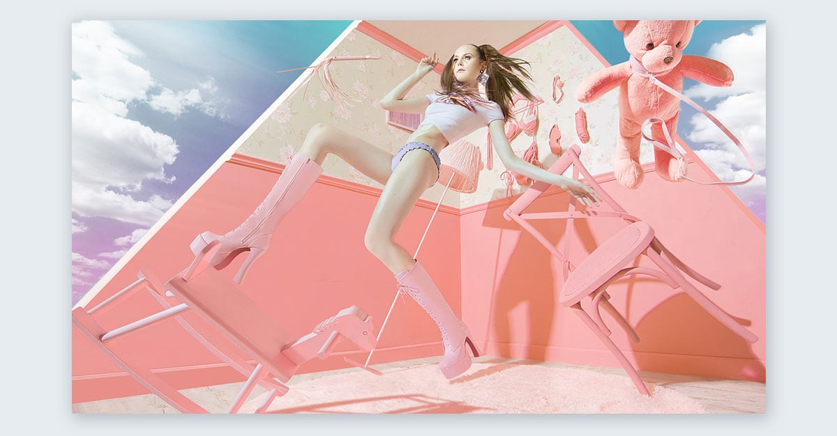
This is another example of a photographer doing work for their own enjoyment. This photoshoot is amazingly futuristic while also beautifully candy pastel. The colors around the model are strong and powerful while also light and airy. The coloring in the photo makes the model’s skin into a pastel hue like the rest of the composition.
Sometimes, finding the perfect visuals for a design project can be challenging. Visme's AI image generator helps you create unique images tailored to your needs. Describe your idea, and choose a style from various options like drawings, 3D graphics, paintings and more. The AI will generate options to inspire or use directly in your designs.
Indonesian illustrator Putri Febriana has mastered the use of pastels in his beautiful illustrations. He uses subtle gradients to give depth to his colorful designs about the cities he visits. His Instagram account is a gorgeous source of pastel inspiration.
Illustration and design studio Down the Street Designs has a great collection of pastel-colored illustrations for high-class clients as well as personal projects. Their illustrations have an added grunge texture and an amazing light and dark harmony.
If you are an illustrator creating pastel-themed work, you'll need access to high-quality visuals. Visme's vector icons and stock image library provide a vast selection of graphics and photos, making it simple to find elements that complement a pastel color scheme and add an extra layer of visual interest.
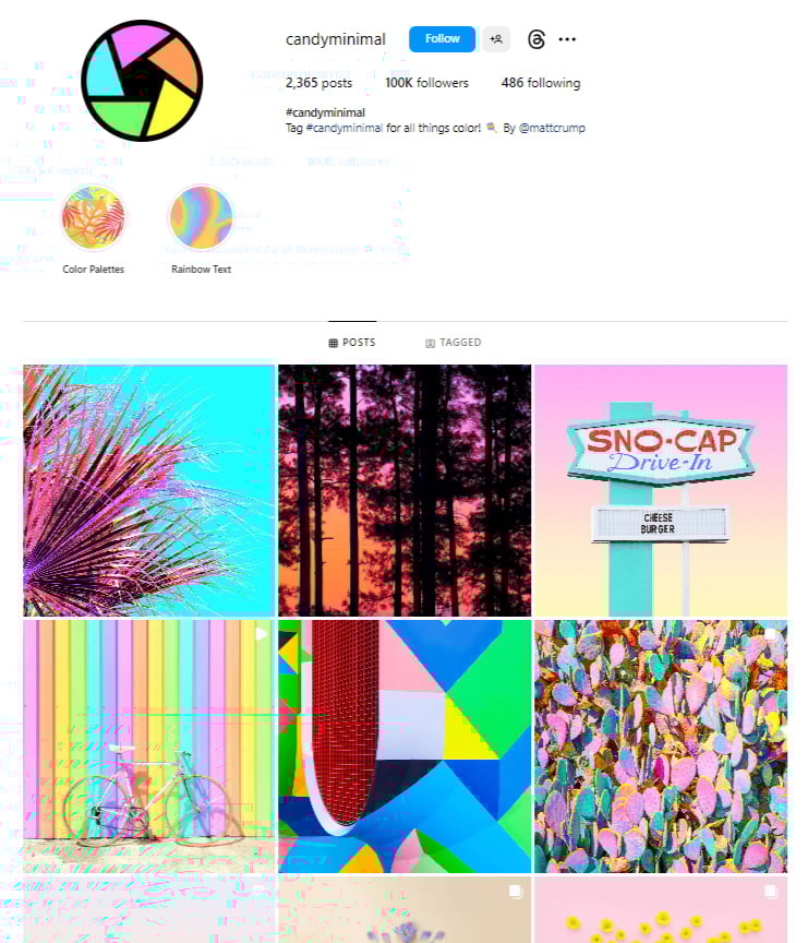
Candy Minimal is a photography movement on Instagram which involves lots of pastel colors mixed with vibrant neons. The color trend got so popular that the team behind A Color Story and A Beautiful Mess asked the creator of candy minimal to put together a filter pack for A Color Story. The Candy Minimal filters will help turn your photos into gorgeous pastel compositions.
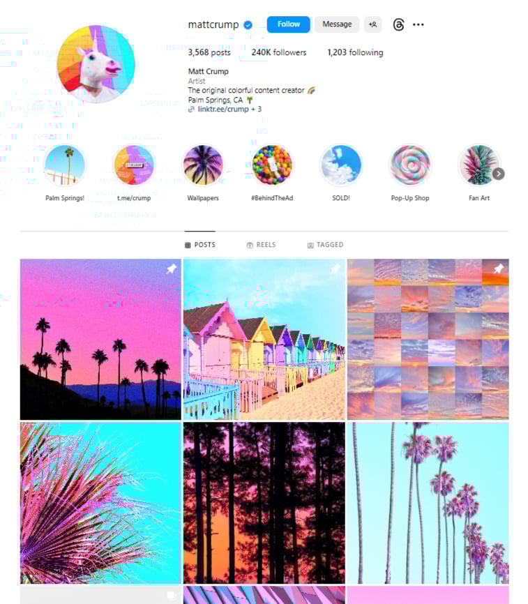
Matt Crump is the creator of the candy minimal trend and his Instagram is a pastel color delight. Follow him for a daily dose of pastel inspiration mixed in with rainbow hues and vibrant neons. If gorgeous pastel visuals could be given a label, it would be Matt Crump and his Candy Minimal.
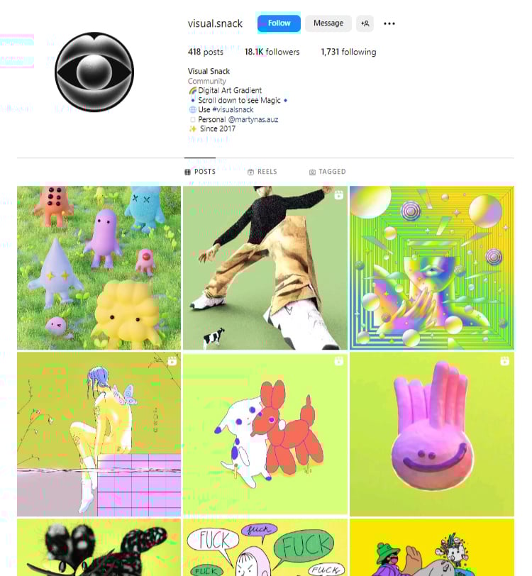
There are plenty of creative curation Instagram accounts, but Visual Snack is special. Even though they showcase different artists, they choose the art they feature to fit a specific color gradient design. Pastel colors have been present many times; at the time of writing this collection, their profile featured a creamy pastel color.
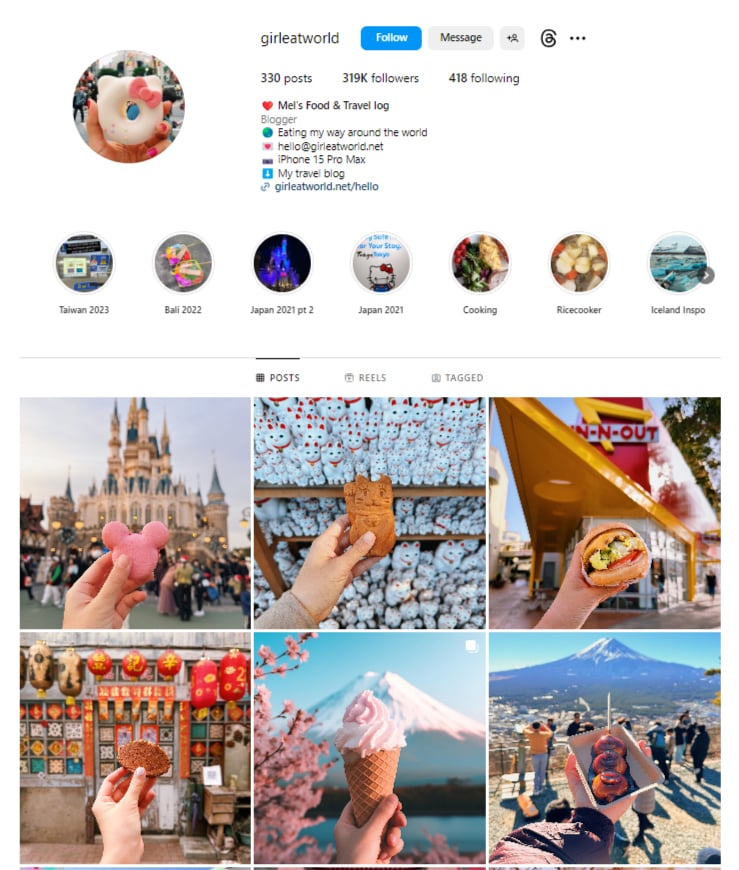
Girl Eat World documents her global culinary adventures with a unique touch. Her photos feature her hand holding delicious dishes, often desserts or ice cream, against stunning backdrops from around the World. The soft pastel tones enhance the visual appeal, making her feed a delicious feast for the eyes.
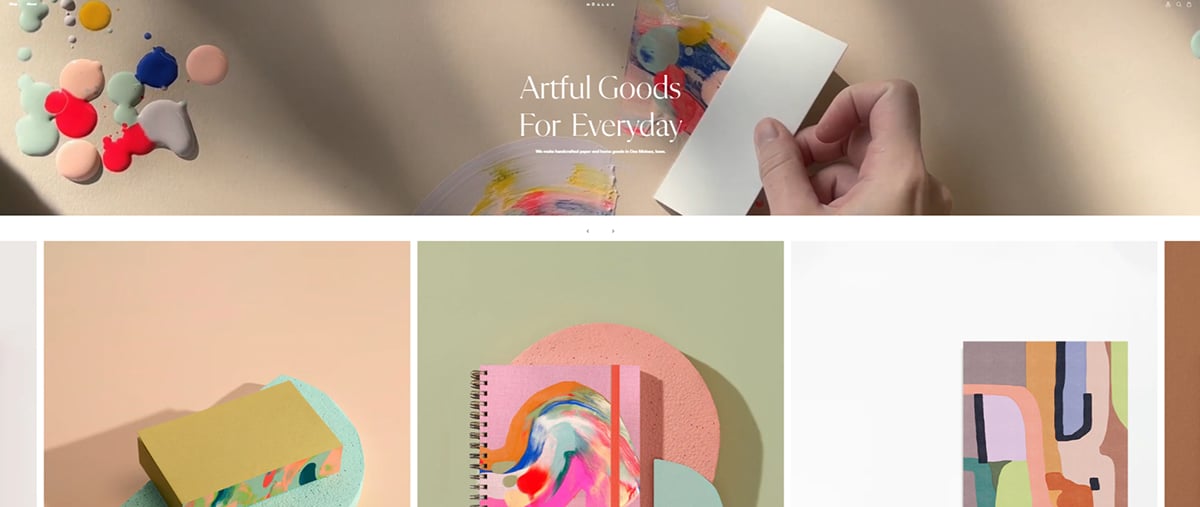
The Moglea Paper Goods and Stationery line is handcrafted in Iowa by a couple of talented artists. Their letterpressed prints, dip dyed paper and hand-painted patterns are beautifully made with pastel hues and soft creams. The notebooks, cards, postcards and wrapping paper collections are gorgeous. Their current Happy Holidays design is perfectly pastel.
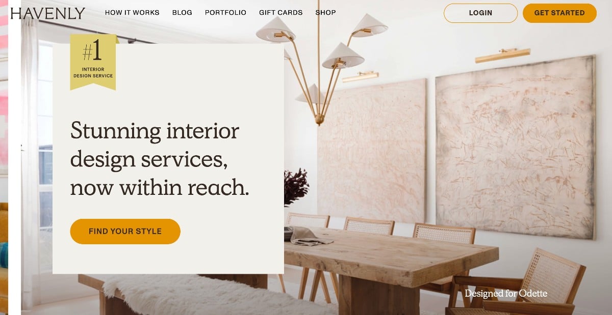
Havenly is an online interior design service that understands the appeal of soft, calming palettes. Their designers often incorporate pastel colors into their room concepts. Browse Havenly's inspiration gallery to discover beautiful examples of how pastels can create a serene and inviting atmosphere in your home.
Pastel websites often aim for a soft, inviting look, but image sharpness is still important. Use Visme's image sharpener to prevent your website's graphics, photos or background elements from appearing blurry. This will ensure a polished and professional look throughout your pastel design.
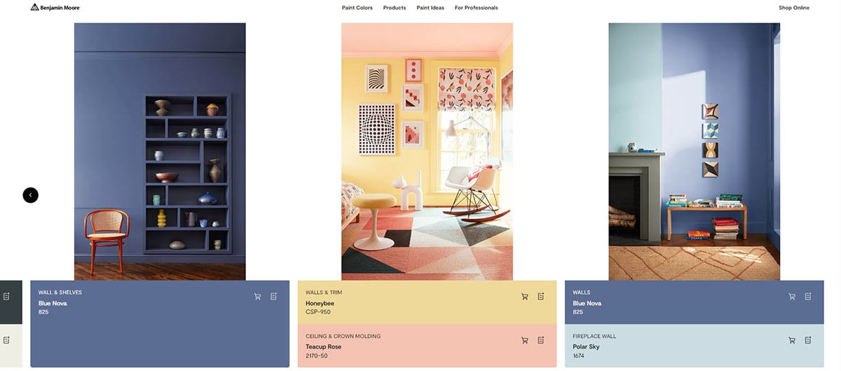
Benjamin Moore's 2024 Color Trends palette highlights pastels' versatility and timeless elegance. Two standout shades are "Blue Nova" (825) and "Honey Bee" (CSP-950). "Blue Nova," a deep and ethereal blue, brings a sense of sophistication to any space. On the other hand, "Honey Bee," a warm and inviting yellow, adds a cheerful touch. These two colors showcase how pastels can be both bold and calming, making them a fantastic choice for various design styles.
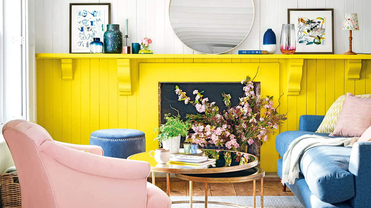
Image Source
Pastel colors remain a hot trend in interior design, but their playful side is taking the spotlight. Think of colors like bubblegum pink, zesty lime green and soft lilac. Designers adopt "dopamine decor," playing with these colors to create cheerful and energizing spaces.
Get a feel of the joyful energy of dopamine decor with this vibrant living room. The bold pink sofa, geometric rug and pops of yellow create a space sure to boost your mood.
Major design events like Maison & Objet (Paris) in 2023 showcased a distinct shift towards earthy, nature-inspired pastels. Think muted terracotta, sandy beige, and vanilla replacing cooler pinks and lilacs. These pastels create a sense of grounded tranquility, proving their adaptability as the foundation for calming, contemporary spaces.
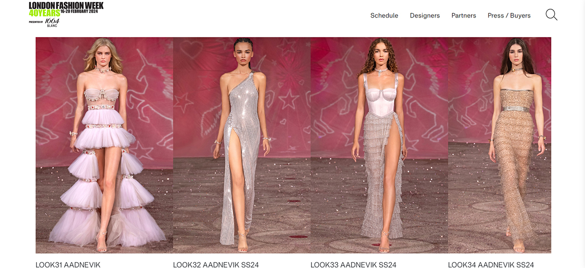
Pastels continue to charm designers with their softness and playful allure. London Fashion Week Spring/Summer 2024 highlighted this trend with a fresh twist. Designers like AADNEVIK embraced pastels in their collections, cleverly pairing pinks and blues. This contrast offers a modern, playful take on the pastel trend, showcasing its ongoing versatility in fashion.
Influencer Simone Noa Hedal brings a playful twist to the pastel trend in Copenhagen's fashion scene. Her "colorful, playful, and experimental" style seamlessly incorporates pastels with vintage treasures and Danish practicality. Embodying Copenhagen's love for casual chic, her look celebrates the ease of pastels against the city's vibrant backdrop, proving style can be both adventurous and effortlessly cool.
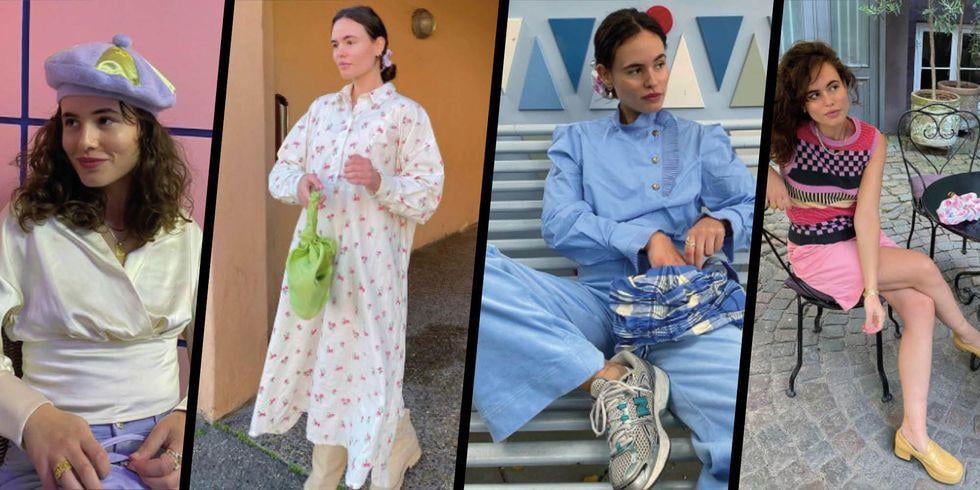
Image Source
Last but not least, a pastel presentation template can give your slides a fun and colorful look. Along with an elegant sans serif font and some vivid imagery, pastel colors look great in templates like these.


The Visme editor has tons of pastel backgrounds ready for your design projects. Simply insert “pastel” into the search box and you’ll find plenty of free images for commercial or editorial use. You can insert them in your presentations, social media graphics, infographics, or any other type of visual content.

Watercolors are still an ongoing trend in graphics and visuals. Pastel watercolors are perfect for social media images, packaging, and branding schemes. They can be used in anything you like. You can find textures like this on Creative Market or Freepik.
Seamless pastel patterns are a wonderful addition to a pastel inspired design. These can be used as backgrounds, details or sections of graphics. Try them in your newsletters, social media graphics or flyers.
The easiest way to get a grip on Instagram stories is to use templates. A pastel stories template collection is perfect for staying on trend with your lifestyle brand. You can find these on sites like Creative Market or create your own in the Visme editor. Keep your templates in your Brand Kit for easy access.
Yes, pastels can also be used in business cards. They might not always be trending, but if they match your brand and style, then they can work just fine. This business card template, for example, has light pinks and blues along with cherry blossoms and a classic white.
Once your pastel design is complete, Visme makes sharing and publishing your work easy. You can post directly to social media, embed your designs on websites or download them in various file formats, including PNG, JPG, PDF and HTML.
Have you been using pastel colors in your visual creations lately? Why not try them next time? Your presentations or your social media graphics can be revived with any of these pastel colors. Simply copy and paste the pastel hex codes in the color picker within the Visme editor or your preferred graphics editor.

Design visual brand experiences for your business whether you are a seasoned designer or a total novice.
Try Visme for free

About the Author
Orana is a multi-faceted creative. She is a content writer, artist, and designer. She travels the world with her family and is currently in Istanbul. Find out more about her work at oranavelarde.com